What do you guys think of this album cover?

glassjaw7

Well-known member
This is the cover art for my band's upcoming EP, Mind Alarm. Originally, my singer and I wanted this to be the inside spread pic (behind song titles, etc) but I like how it turned out so much that I want it to be the cover. We have a cool art concept that fits the title track "Mind Alarm", but I'm digging this and am pretty set on it. I designed this with my good buddy Heath Tullier of Icon Studios.

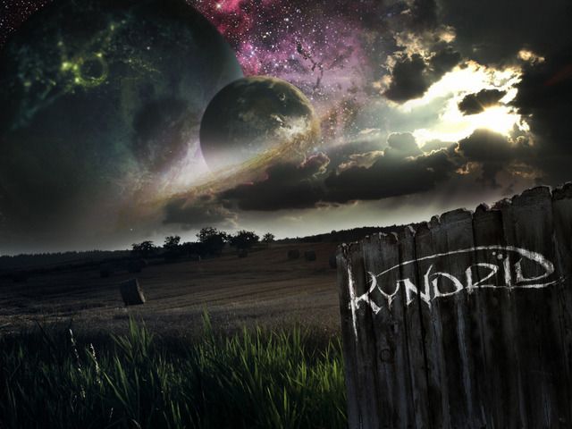
I've heard people say "never use a landscape style pic for an album cover", but I say fuck that. :LOL: :LOL: Thoughts?- What type of music do you think this artwork implies or represents, without hearing us first???

KYNDRID-Landscape1.jpg
 
scottosan":2nmr3nbe said:
Would have to here some of the music to see if it matched.

I'll be popping a couple tracks up in about a month or so. What style/genre do you think of based on the artwork? I'll be honest, it turned out a much different "mood" than I intended, but I love it! I think people would be surprised how the music sounds based on this.
 
I'm gonna be honest. It looks kinda cheap. The planets look awesome, but something about the landscape and the writing make it look 'local band-ish'. If you got rid of the landscape part, it might look a lot more professional. That's my honest opinion. With that being said, I wouldnt be able to come up with anything near as good looking as that, so I'm not just being an ass.
 
severinsteel":log63poq said:
I'm gonna be honest. It looks kinda cheap. The planets look awesome, but something about the landscape and the writing make it look 'local band-ish'. If you got rid of the landscape part, it might look a lot more professional. That's my honest opinion. With that being said, I wouldnt be able to come up with anything near as good looking as that, so I'm not just being an ass.
:cry: :LOL: :LOL: it was done by a pro artist and if I didn't have a hook-up, would've cost a LOT!
I appreciate your opinion though, as that's exactly what I'm looking to hear.
 
deadweight":abl71vb8 said:
prog rock / psychedellic is what i think

See, that's the issue I'm dealing with. I came up with the concept for a full length, and the material we were writing last summer was very progressive, moody, deep, etc. We will still record those songs eventually, but the two or three tracks on the EP will sound much more commercial hard rock. I write in the style of AIC, Floyd, Devin Townsend, etc, but my singer writes very catchy, almost "mainstream" stuff.
I'm not sure that this fits the music, but I'd hate not to use it. Don't want to take advantage of my buddy either, and request that he do another design...
 
I think Dream Theater comes to mind. I like the planets also , not sure if i love the fields and fences.
It's almost too busy and it kinda takes away from the cool stuff like the space cause you eye is looking everywhere.

Kinda like having a web page with 15 different fonts can be distracting .
I like the look but agree that simpler may be more effective for that type of thing
Guys talented no doubt though
 
I like it. Musically, I would think it represents atmospheric metal with cool sounding/evolving pads and drones.
 
gtr31":25t6ffsb said:
I think Dream Theater comes to mind. I like the planets also , not sure if i love the fields and fences.
It's almost too busy and it kinda takes away from the cool stuff like the space cause you eye is looking everywhere.

Kinda like having a web page with 15 different fonts can be distracting .
I like the look but agree that simpler may be more effective for that type of thing
Guys talented no doubt though

Thanks for the feedback. The fence with the band logo came late on, after I decided to make it the cover. At first it looked like this when it was going to be the inside cd cover background:

MindAlarmEPcover.jpg


Had a cool concept about a clock coming out of a dude's head for the title "Mind Alarm". Maybe I should go back to that idea and put this on the inside cover?

IHateRap":25t6ffsb said:
I like it. Musically, I would think it represents atmospheric metal with cool sounding/evolving pads and drones.
I wish that was the case. This is much more mainstream hard rock. Not very ambient, which is a bummer because that's really my style. I have fun with this band though. :thumbsup: Thanks guys!
 
Like it.

[but then I'm absolutely fascinated with anything to do with the cosmos, so it's a shoe in for me to say 'like it']
 
I like it. A lot.

The first thing that came to mind was the old Uriah Heep and Yes album covers, but without the "fantasy art" look.
 
honest opinion i think it looks pretty damn good, yes it looks a little fake on the computer screen but i think it would fine on a real cd. i like it, of course it would depend on how the music sounds like though.

my only complaint is that some people might have trouble reading the band logo, i wouldnt completely change it but maybe clean it up just a bit
 
I think its killer!! Maybe darken the sky a little more but I love it. A couple bong hits and I bet I see a lot of shit poping out :LOL: :LOL: :LOL: :LOL:
 
Looks great!! Very pro-looking and feels expansive.

I agree, progressive, Dream Theatre vibe.

Like to hear the tunes...Good Luck with the release!
 
keep the planets

lose the fence

blow up the band name, have the sunlight on the right act like it is casting the band name some ray's

Slap in dead center and be done. The background is not the main theme of the band the band is the main theme of the background.
 
Back
Top