Lickliter Amplifiers new look!

  • Thread starter Thread starter LickliterAmps
  • Start date Start date
LickliterAmps

LickliterAmps

Well-known member
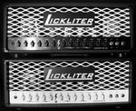
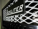
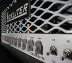
Here are the initial changes applied to the look of my amplifiers. The logo is still a prototype as I am working on a couple more ideas with an artist and a machine shop concerning a CNC'ed billet nameplate. Also the screen can be in black or white. The lightning bolts have been since retired and the clean channel now has a crunch / clean switch. Here are some pics for review. :student:
 

Attachments

  • 100_2763.JPG
    100_2763.JPG
    1.2 MB · Views: 727
  • 100_2766.JPG
    100_2766.JPG
    970.5 KB · Views: 721
  • 100_2767.JPG
    100_2767.JPG
    1.3 MB · Views: 721
MUCH better......classier, more solid. Good job.
 
100 times better. looks great. sorry I had to be the guy to bring up the 'elephant in the room' about the old logo originally. it wasn't meant to bash you or your amps, just to point out the only thing a bit off with these killer amps. and I mean that, everything I've heard sounds great
 
still something aesthetically off with the blocky name badge-
maybe a more rounded outline around the lettering. i'm a big fan of understated logos that are smaller in size and more elegant. enlisting a graphics/logo designer is a good plan.

i love the look of my peacemaker head yet others think it too modern:
mojave-peacemaker-front.jpg


and not trying to be harsh but the word "lickliter" doesn't roll off the tongue and has curious connotations.

for my tastes i'd go with "L" amplification

by contrast, "surreal" has a nice flow but jerry's aesthetics never line up for me cohesively.
classicsquared003.jpg


001.jpg
 
mentoneman":3vs32l5a said:
and not trying to be harsh but the word "lickliter" doesn't roll off the tongue and has curious connotations.

:hys:
 
mentoneman":37lhbeps said:
....

and not trying to be harsh but the word "lickliter" doesn't roll off the tongue and has curious connotations.

How about Litelicker? \:D/

Just kidding.....the logo looks much better. ;)
 
se7en":ngcit4ob said:
ejecta":ngcit4ob said:
mentoneman":ngcit4ob said:
and not trying to be harsh but the word "lickliter" doesn't roll off the tongue and has curious connotations.

:hys:

How about a big tongue next to it?
tongue%20sticking%20out%20rolling%20stones.png

I think there would be a copyright infringement if I was to use something like a rolling stone. I had my doubts of using the name and went thru different ideas and came real close to changing it. I have since decided to keep it and believe in it!
The name fits well in an amplifier. It will roll off the toungue much easier as they become more known. :)
 
C'N'C that sucker! I dig the clean/crunch switch :thumbsup:. If voiced right it works great :rock: (Diezel does a real good job with the Ch. 1 mode switching on the Einstein.)
 
you should get rid of the expanded metal grille. that looks kinda cheap in person.
all these amps look like an slo, the soldano look has been done to death. you need to come up with a unique grille or something.
 
do like a grainy leather in black with nothing on it but a big "L" like the one laverne dafazio gave to Lenny the "L"one wolf..
 
wIsEbLooD":2g8if7mq said:
you should get rid of the expanded metal grille. that looks kinda cheap in person.
all these amps look like an slo, the soldano look has been done to death. you need to come up with a unique grille or something.

+1. Looks cheap to be honest. I like the lightning bolt and the dualism of the black/white, though.
 
Like the new look. Personally i think if you made the logo a little smaller and put it in like the upper left corner instead of large and center would look better.
 
First off...it looks much better than the one in your Avatar. However I tend to agree with some of the above posters. I'd go for an even more understated logo and I'd drop the grill. It's been done to death...I'd go for something a little more unique at this point. Looks better though...nice job.
 
Back
Top