mentoneman":1u04ysg6 said:
off the top, i'd love to hear your amps in person-and i really want your amp business to succeed.
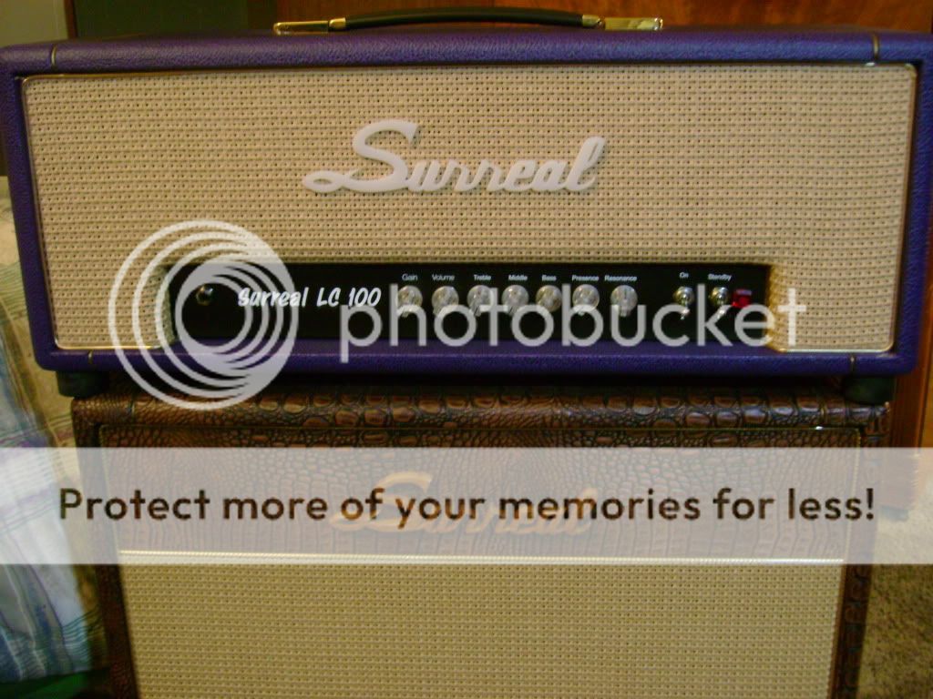
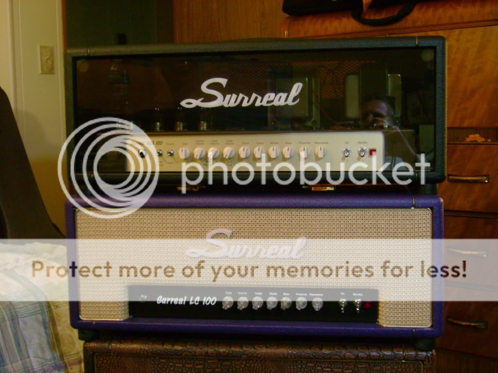
here's what i see. cosmetically, the logo, the print used for the model types, the control faceplate marriage with the headshell wood, and the knobs just doesn't seem to attract me or make much design sense.
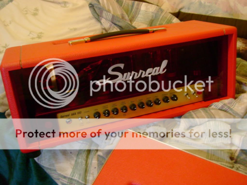
the logo style reminds me of a cheap chinese knock off. the "r"s look like "n's, the "S" seems clumsy and almost hand drawn, although i admire sticking to the fish element myself...the wicker cane against the red tolex, and the black tolex/smoked glass combinations were the only design elements of any of your amps i found attractive.
by comparison steve's cherry bomb amp was very elegant visually/cosmetically speaking and i agreed with every design decision he made. his cosmetics have a symmetry and unity your amp's visuals are missing.
+1
I didn't love Steve's cherry bomb cutouts on the panels, but it works in the sense that it's part of a well-conceived theme.
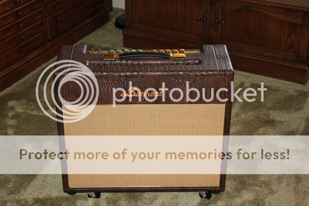
I'm not getting the same cohesive feel here. With the exception of the croc one they are kind of all over the place. The logo is the only consistent theme - all the other parts are a mixed bag. Different panels, knobs, etc. I'm no marketing guru but I think it's important to have consistent visual cues that the audience will always connect back to you. The logo could be the big one, but I'm not feeling the stark white...on the logo or on the faceplates.
But I love the croc one. And I think that's partly because it all works together. The color of the croc matches nicely with the basketweave and having some color to the logo makes it fit in nicer.
My .02? Make some choices. Pick a panel style and stick with it. Make it yours. Pick a tolex style, a knob, a font, etc., and stick with it. Make it yours. Once you've got your hooks into people's brains, then you can open up more choices for colors, knobs, etc. I'd even go so far as to say the consistency is more important than even the quality of the design. Look at the Diezel logo...I hate (sorry!!) that logo. But it's been in front of us for years now and everybody knows that when they see that logo they are in for a whoopin'.
I know its the tone that matters. But so many people buy with their eyes first. Sad but true...
Look at the big hitters. Soldano, Bogner, Anderson, ESP, whoever. Most anybody with success. You can recognize their amps/guitars from a mile away. Even the guys who are just now gaining traction...look at Luxxtone. He's got his headstock nailed down, he's got his textured finish thing nailed down. People will now seek those out.
Ok that got long. Sorry!