You are using an out of date browser. It may not display this or other websites correctly.
You should upgrade or use an alternative browser.
You should upgrade or use an alternative browser.
Rev
Active member
A
Anonymous
Guest
I dig it. Much better IMHO...
Steve
Steve
mrTapp
Member
maybe if the plate was smaller in relation to the letters....
...and if there are som stage lights on that one...what would you see?
...and if there are som stage lights on that one...what would you see?
LickliterAmps
Well-known member
I agree. Plate could be smaller. Keep the ideas coming! Appreciate all the input! 
1
155
Well-known member
get them cnc'd like fortins looks killer
jcmlespaul
Member
Good move
LickliterAmps
Well-known member
lester
Well-known member
Are you absolutely sold on the name Lickliter?
gbsmusic
Well-known member
ejecta
Active member
lester":23y9oxx2 said:Are you absolutely sold on the name Lickliter?
I have to agree... not crazy about the name.
LickliterAmps
Well-known member
pronounced -Lick lighter- I think it is a great name for a guitar amplifier!
gbsmusic
Well-known member
I think everyone was pronouncing it right, it wouldn't be my 1st choice in a name but if it works for you thats all that matters.LickliterAmps":308rmixe said:pronounced -Lick lighter- I think it is a great name for a guitar amplifier!
The Hoff
Active member
Yeah. I like that look a whole lot better. Good stuff sir! 
LickliterAmps
Well-known member
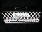
With the existing plate being 10" wide X 3" tall, I will enlarging the logo a little bit to fill the space and make the lettering white on a black background. I will be posting pics on next change. 
steve_k
New member
My 2 cents....the logo is much too big. The large plate masks the mean look of the metal grill and mojo of the amp. Have the name stamped out of aluminum stock and not etched on a plate.
M
MYLILSS
Well-known member
If that amp pictured was in white tolex with white chickenheads, i'd be willing to buy on looks alone
snowdog
Active member
Well, I agree the original logo needs some work....but I do like it better than this new version. There are tons of cool fonts out there...keep looking.
Hollywood
Active member
I think incorporating the name or logo in as part of the front face plate instead of the steel mesh and separate name plate or logo would help you keep the amp in line with what you have and make your product a touch more desirable. ymmv.... 
LP Freak
Well-known member
I just noticed you've got the lightning bolt thing going on on the faceplate too. 