You are using an out of date browser. It may not display this or other websites correctly.
You should upgrade or use an alternative browser.
You should upgrade or use an alternative browser.
M
MYLILSS
Well-known member
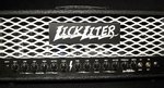
i really like the white grill. my personal opinion would be to add white chickenhead knobs to the amp as well to complete the look, but all in all the white looks awesome
LickliterAmps
Well-known member
Thanks for the feedback. I think I would like the white chicken heads as well! The other amp that I am re-doing has a white faceplate / white chicken heads. 
primerib
Member
Don't take this the wrong way, I mean it constructively. But you really should refine your logo. If I'm to shell out top dollar for a custom amp (and I have many times), aesthetics mean a little more to me.
LickliterAmps
Well-known member
What do you suggest? Raised lettering with a plastic mold or CNC'ed with billet aluminum? Either way it will be add to the cost of product. 
LP Freak
Well-known member
Change the lettering on your logo. No offense, but it's not very appealing.
M
mrkmas
New member
I think it looks great.
Mizati20
Active member
The "lightning bolt"-esque lettering on the logo is pretty tacky... borderline horrid... everything else looks killers though!
thenine
Well-known member
I like the one in your avatar better. The white/black w/ red chickenheads is coolio!
skoora
Well-known member
thenine":1l4x5gg5 said:I like the one in your avatar better. The white/black w/ red chickenheads is coolio!
I agree that does look good. Hate to say it but I agree with the negative responses for the font for the nameplate too. Looks like I'm trying ideas for an imaginary band's logo in high school. Amp itself looks nice.
bubbastain
Well-known member
LP Freak":2iu7rh6q said:Change the lettering on your logo. No offense, but it's not very appealing.
I think your amps sound really good and the build quality seems great too, but I have to agree that the logo is not very appealing. The white grill looks cool.
Kapo_Polenton
Well-known member
Unless you are Ace Frehley, the lightning bolts will not appeal. The amp in the avatar does look great though so don't change that. Red knobs, black grill. However, the logo is very "Scribbled on a binder in high school " (as was mentioned)
primerib
Member
LickliterAmps":1bqgazxf said:What do you suggest? Raised lettering with a plastic mold or CNC'ed with billet aluminum? Either way it will be add to the cost of product.
no, it can be on the same material, but the logo artwork you have now looks silly, almost primitive. the rest of the amp looks great though. maybe have an art guy give it an update. just a thought.
rottingcorpse
Well-known member
i would change the logo too, if not the name itself. simple is way better. block letters.
having spoken with you, i know it is lickliter (lick-lighter), but most are probably pronouncing it lick-litter. not simple, easy to mispronounce, not effective. this is strictly from a marketing prospective.
cant wait to try one next month. call you this weekend.
having spoken with you, i know it is lickliter (lick-lighter), but most are probably pronouncing it lick-litter. not simple, easy to mispronounce, not effective. this is strictly from a marketing prospective.
cant wait to try one next month. call you this weekend.
maddnotez
Banned
Well-known member
rottingcorpse":j11xuasx said:i would change the logo too, if not the name itself. simple is way better. block letters.
having spoken with you, i know it is lickliter (lick-lighter), but most are probably pronouncing it lick-litter. not simple, easy to mispronounce, not effective. this is strictly from a marketing prospective.
cant wait to try one next month. call you this weekend.
He's right, I thought it was Lick Litter, like cat litter.
Maybe instead of a name logo just have a picture of a tounge and a lighter? jk
I like both amps, the avatar looks better.
What about a combo, black and white with RED knobbies?
LickliterAmps
Well-known member
Thanks for all the feedback. I am working with my engraver on some possible new ideas on the font. I will post on forum the new proposed ideas when I get them. Appreciate it!
Kapo_Polenton
Well-known member
Copy the Pirelli font style and with the red knobs and black faceplate, that could look pretty sick. ( A Big L that underlines the rest of the name)
LP Freak
Well-known member
I'm sure there's some guys around here that would be willing to help if you were looking for some ideas on the logo.
maddnotez
Banned
Well-known member
Just an idea. Not sure how accessable it would be, But maybe user gets to pick color scheme on the amp? No one really does that.
PS I was not making fun of your name.
PS I was not making fun of your name.
LickliterAmps
Well-known member
LP Freak":1jk3ql58 said:I'm sure there's some guys around here that would be willing to help if you were looking for some ideas on the logo.
Anyone have any ideas?
Thanks
Similar threads
- Replies
- 5
- Views
- 574
- Replies
- 41
- Views
- 1K
M
- Replies
- 8
- Views
- 862