Lickliter new look for amplifiers

  • Thread starter Thread starter LickliterAmps
  • Start date Start date
maddnotez":2z21rykz said:
Just an idea. Not sure how accessable it would be, But maybe user gets to pick color scheme on the amp? No one really does that.

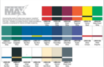
User can always pick the color scheme. Here is a color chart for the front and rear panel. Any color tolex that is availiable can be chosen as well! :yes:
 

Attachments

  • image003.png
    image003.png
    327.1 KB · Views: 881
I like the white one in your avatar better but they are very similar. The logo isn't bad if your only shooting for the metal audience but it kind of pigeonholes you. Otherwise the Logo reminds me of 80's era peavey stuff. I usually prefer a more vintage or traditional appearance. I always thought diezels, peavey xxx, krank were ugly looking cosmetics.
 
primerib":2dgqmzhs said:
Don't take this the wrong way, I mean it constructively. But you really should refine your logo. If I'm to shell out top dollar for a custom amp (and I have many times), aesthetics mean a little more to me.
what like cameron and CAA.. there isnt much to theirs either, actually quit boring looking.. man i think this amp looks great.. the white grill sets it off, bar none one of the coolest looking custom amps ive seen..
 
I love the look of your amps, being able to see the tubes looks cool and is tech. perfect. Plus if you are going to allow custom color options what more do we need? pure kick ass mike. Hope I can try one soon. If I was to get one custom I would ditch the white grill for black as well. and maybe shrink the logo just a bit and move it to a corner just to see the tubes better. Maybe a few blue leds. to make the tubes and white logo and white lettering on the faceplate glow....
 
Ok Got some ideas and I am not sure about this yet. Comments welcome. Sometimes less is better IMHO.
 

Attachments

I would like to see the blackhead shell with a white chassis, white grille, black lettering and black chicken head knobs. I think it would look sweet.

I agree on the logo, it looks too gimmicky. Think classy and powerful.
 
LickliterAmps":2bymf3ou said:
Ok Got some ideas and I am not sure about this yet. Comments welcome. Sometimes less is better IMHO.

I like the last one the best out of those.
 
LickliterAmps":1fjhv691 said:
Ok Got some ideas and I am not sure about this yet. Comments welcome. Sometimes less is better IMHO.
I like the new font idea too. The 2nd to last or last one would be my choice as well. Logos are a HUGE deal with marketing just ask Steve Jobs. I would keep tweeking it and taking feedback from players/customers. Maybe have the logo reliefed into the logo plate or ditch the plate and have the logo just be the text? But both of those things cost extra money. Either way I like the direction your going with the font text.

Amps look sweet tho! I really like your head shell -vs- face plate contrasting colors. Alternate knobs color options are always welcome in my book too. :2thumbsup:

BTW: I have a DR. Z 6545 (2 channel amp) and was wondering if you would be able to mod the OD ch. on it? If you are unfimilar with it. It's basically Dr. Z KT 45 amp as the clean side (Hi-Watt/Vox type thing) and the OD channel is his SRZ 65 amp (which is based on a marshall) You may be able to mod the SRZ side I think? :confused: PM me either way.
 
I vote for the last one too but I'd still give it a little more thought. Definately an improvment over the lightning bolts. :thumbsup:
 
LP Freak":2wl0c4jt said:
I vote for the last one too but I'd still give it a little more thought. Definately an improvment over the lightning bolts. :thumbsup:

+1
 
I'm a professional Designer, the last one is by far the best! Clean and classy.
 
LP Freak":17va0ud7 said:
I vote for the last one too but I'd still give it a little more thought. Definately an improvment over the lightning bolts. :thumbsup:

+1 :thumbsup:
 
2nd last gets my vote! That's the one that has the Pirelli feel to it. the last one has more of an industrial feel to it like you are a shipping company for heavy equipment. 2nd last says style and that you are ready to party hard and fast! :rock:
 
Here is a proposed look based on prior feedback. I merged 2 styles together. Appreciate all the input!
 

Attachments

  • logo.jpg
    logo.jpg
    190.1 KB · Views: 745
fuck yeah mike, that's badass! now take my idea and move it to the corner and turn the amp all black
 
Got the grill work complete. The logo is still in progress, but otherwise-finished with this one except for the logo plate. I believe I will be using aluminum for this, but haven't got all the details worked out yet. This amp will be opening the show for Testament / Anthrax / Death Angel. Worlds Divide guitarist will be sporting this one at the Iguana Stadium in Tampa, Florida 02/01/12. I will be trying to get some live footage. I will keep everyone posted on the results! :rock:
 

Attachments

  • Amp 5.JPG
    Amp 5.JPG
    809.7 KB · Views: 720
  • Amp 5 & cab front.JPG
    Amp 5 & cab front.JPG
    1.3 MB · Views: 720
  • Amp 5 & cab back.JPG
    Amp 5 & cab back.JPG
    438.7 KB · Views: 722
Back
Top